Introduction.
Mia is characterized (I believe) by her cute eye movements and her rich eye expressions of joy, anger, and sorrow when you pet her head, and I would like to describe the story of how I created over 100 different rich eye expressions in Figma through trial and error.
Initially there was a mouth, but it was difficult to control.
Mia actually started out with a mouth as well, with an elastic rubber (such as hair elastic) fixed in several places with nails, so that the mouth would move when the motor was moved.
Looking back at it now, it is slightly scary as it is two times larger than the production version, but that’s the beauty of it.
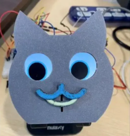
However, it was difficult to maintain the mechanism to keep the rubber from coming off, and we also had to make the motor as quiet as possible, otherwise, Mia’s speech would be drowned out by the sound of the motor. We considered several options, including the use of servo motors, step motors, and silent brush motors, but we could not come up with the best solution, including the price, so we decided to eliminate the mouth and use eyes.
I wanted to reproduce rich facial expressions, so I decided to eliminate the mouth and focus on how to express joy, anger, sadness, and anger using only the LCD display of the eyes.

Verification of eye size
The ST7735S 1.44″ 128 x 128 pixels is used as the eye display in this project. We tried to determine how large the eyes should be in a square, 128-pixel size.
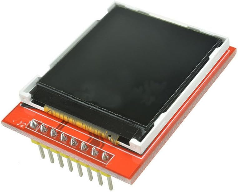
ST7735s 1.44″ display
At first, the entire size of the eye including the iris was created at 100px and the pupil part at 72px, and the iris part was as large as 28px (left figure below), but it looked uncomfortable, so we narrowed the overall size to 92px, the pupil part to 76px and the intersection part to 16px (right figure below).
Now that it was no longer uncomfortable, we proceeded with this size for once.
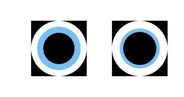
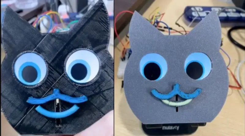
However, as the entire enclosure gradually became smaller with each version upgrade, I began to think that if the entire eye is 92px and the pupil is 76px (see left below), this is cute, but the eyes are a little too emphasized.
Finally, we settled on 80px for the entire eye and 68px for the pupil area. Initially, the iris area was sky blue, but the theme color was changed to emerald green, so the color of the iris area was also changed to match the emerald green.
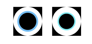
The size of the pupils of the eyes is a matter of preference for further px-by-pixel modification, but I personally think the current size is fine.
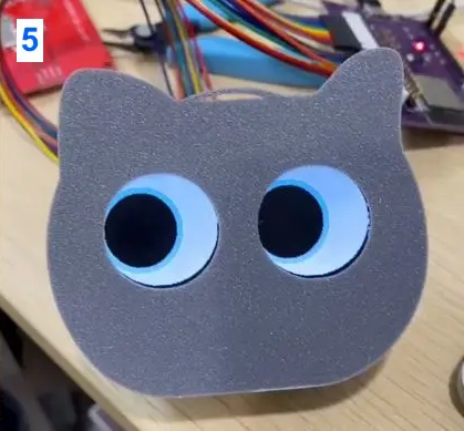
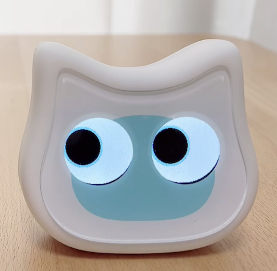
Verify the various eye expressions with Figma incessantly.
From the initial design stage, when it was assumed that not only eyes but also a mouth would be added, various eye designs were verified until noon.
I think we created more than 100 types, or more than 200 if you include trial and error.
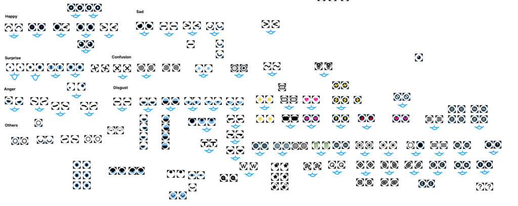
I tried creating something that looked completely cartoonish, brought in the letter “m” for Monster Energy hanging down, tried a horror-like/sleep-deprived look, added geometric patterns, etc.
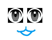
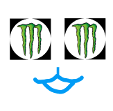
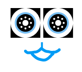
Even though they are the same cute, we decided not to adopt the realistic look of the cartoon eyes because it seemed less consistent with the other icons, was strangely realistic, etc.
For example, the sleepy-eyed expression shown below is more like a person than a cat, and I felt it was not quite right, so I adopted it only about 20% of the time.

The extracted eye expressions were then classified into cases by expression type, such as joy, anger, sadness, sarcasm, and confusion.
The phrases that Mia speaks are also divided by joy, anger, sadness, and anger, so we also programmed the actual phrases that she speaks to match the expressions in her eyes.
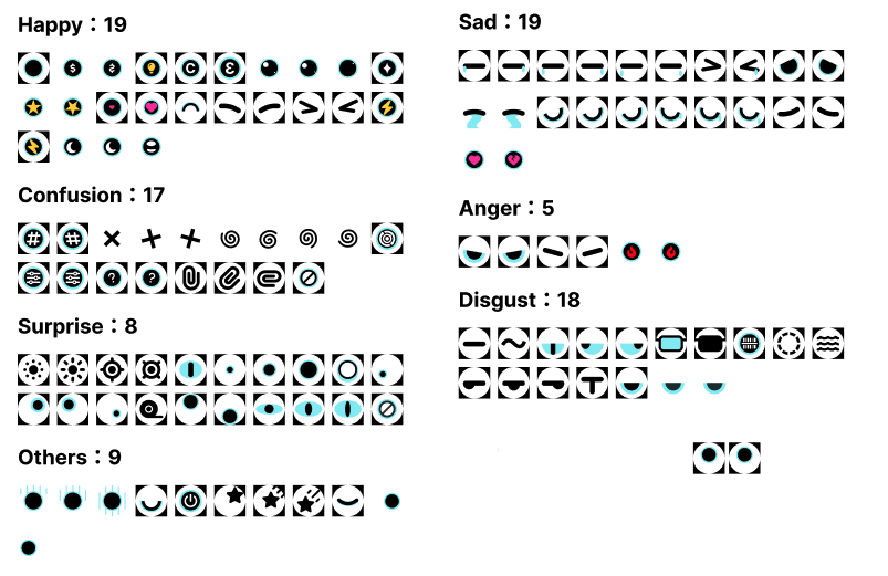
In addition, after comparing still and animated images for eye expressions, we decided that movement would be more interesting, so we prepared as many animated images (gifs) as possible.
In addition to the cute expressions that would be accepted in so-called Asian culture, we also dared to include geometric symbols, such as a light bulb icon when a new idea is sparked or a flame symbol when angry, to give a part of the robot feel.

I searched Google for keywords such as “animal eyes,” “robot eyes cute,” and “anime eye expressions,” and scoured the image results, listing the eye expressions of other characters in X and other places.
I also went through all of Google’s material design icons and picked out the ones I could use.
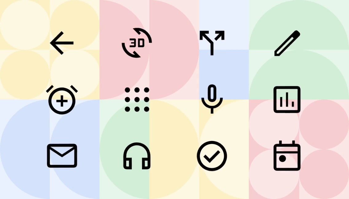
I am glad that we were able to provide a variety of looks in the end.






Expandability of future expressions
We have prepared more than 100 different eye expressions as defaults at the time of the beta release, but in the future, we would like to expand this so that users can create their own eye designs as well.
Specifically, if you write an eye design in the app (we are considering using AI to correct and support it to some extent), you can reproduce that eye design in your meer, and you can import interesting eye designs created by others into your meer, so that we can all create a system to increase the number of eye designs in the meer. We would like to create a system to increase the number of eye designs in Mia by everyone.

